SliverContainer
SliverContainer is a sliver that gives its sliver a foreground or background box widget, this is useful if you want a sliver to look and feel like the child of a regular widget.
In the below example we have two SliverLists with DecoratedBox as a background:
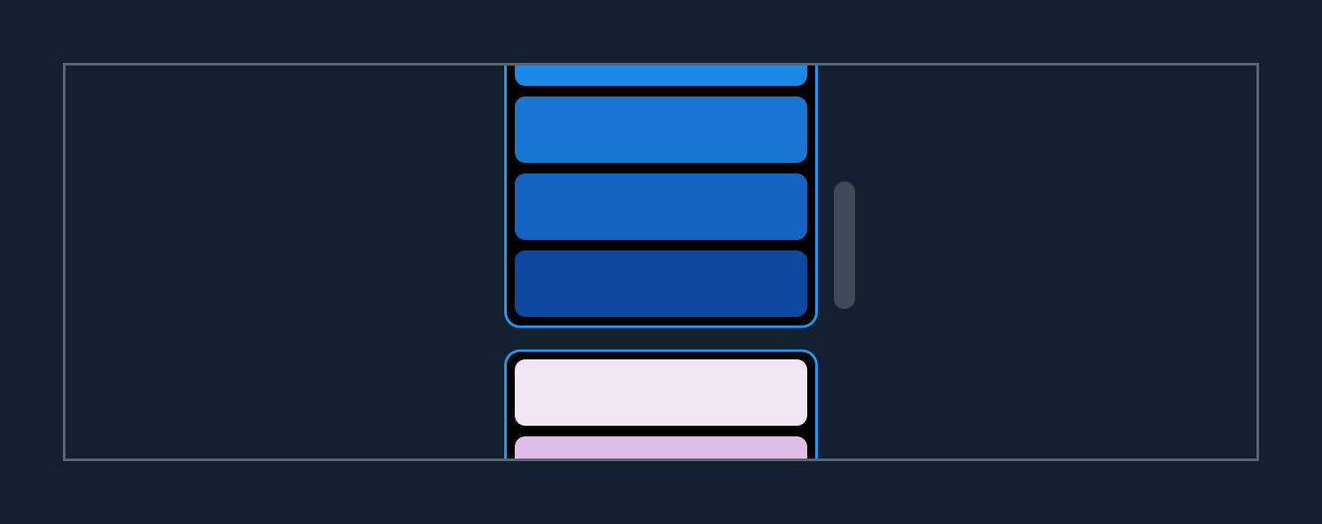
By giving the CustomScrollView a clip of Clip.none, you can see how this is possible:
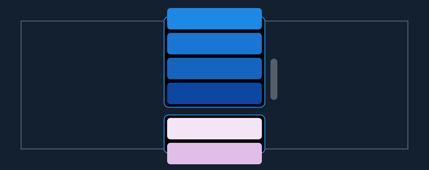
The DecoratedBoxes are stretched so that their top and bottom edge are barely out of view, while the contents of SliverList are still lazily built.
final colors = [
  [
    Colors.blue.shade50,
    Colors.blue.shade100,
    Colors.blue.shade200,
    Colors.blue.shade300,
    Colors.blue.shade400,
    Colors.blue.shade500,
    Colors.blue.shade600,
    Colors.blue.shade700,
    Colors.blue.shade800,
    Colors.blue.shade900,
  ],
  [
    Colors.purple.shade50,
    Colors.purple.shade100,
    Colors.purple.shade200,
    Colors.purple.shade300,
    Colors.purple.shade400,
    Colors.purple.shade500,
    Colors.purple.shade600,
    Colors.purple.shade700,
    Colors.purple.shade800,
    Colors.purple.shade900,
  ],
];

class MyWidget extends StatelessWidget {
  const MyWidget({Key? key}) : super(key: key);

  @override
  Widget build(BuildContext context) {
    return CustomScrollView(
      slivers: [
        for (var swatch in colors)
          SliverContainer(
            background: DecoratedBox(
              decoration: BoxDecoration(
                border: Border.all(color: Colors.blue),
                borderRadius: BorderRadius.circular(6.0),
                color: Colors.black,
              ),
            ),
            bufferExtent: 6.0,
            padding: const EdgeInsets.only(bottom: 4.0),
            margin: const EdgeInsets.symmetric(
              horizontal: 16.0,
              vertical: 4.0,
            ),
            sliver: SliverList(
              delegate: SliverChildBuilderDelegate(
                (context, index) {
                  return Container(
                    decoration: BoxDecoration(
                      color: swatch[index],
                      borderRadius: BorderRadius.circular(4.0),
                    ),
                    height: 25.0,
                    margin: const EdgeInsets.only(
                      left: 4.0,
                      right: 4.0,
                      top: 4.0,
                    ),
                  );
                },
                childCount: swatch.length,
              ),
            ),
          ),
      ],
    );
  }
}